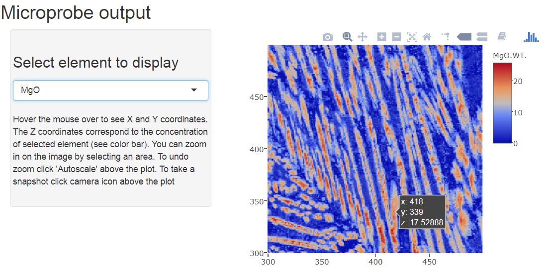
This post features interactive elemental maps that were created for plotting electron microprobe analysis (see previous entry). Now you can visualize the output without needing to install any software. Elemental maps show distribution of concentration for each element in spacial 2D coordinates, X and Y. In this particular example a komatiitic basalt with some alteration is used. You can navigate the analysis by choosing different element and hovering the mouse over the image to see the concentration of the chosen element (Z axis).
The colors reflect the concentration corresponding to the wt. % value on the color bar. When Al2O3 is selected (default), elongated grains of clinopyroxene are shown with blue color (relatively ow Al2O3). This can be compared to concentration of other elements: high Ca, high Mg. This is a pyroxene pigeonite-augite. If the sample studied in SiO2 mode, one can clearly see quartz - red patches denote high concentrations of silica.
THE LINK TO INTERACTIVE MAP
The code is written in R with plotly package for plotting ans ShinyApp package to create an interactive output. Let me know if you would like to try this code for your own elemental maps.
Thanks for sharing an article like this. The information which you have provided is better than another blog.
ReplyDeleteVisit Us at
Optical store on scott road
Eyeglasses in surrey
Best contact lenses in surrey
Eye doctor in Surrey